

Can you believe the pharmacy store was designed like this!
Project name: K Pharmacy Design
The total space of 85㎡ is divided
Exhibition space (65㎡)
Service space (20㎡)
The display space consists of a sales area and a non-pharmaceutical display area, while the service space includes a laboratory, lounge, kitchen, toilet and storage room. Design goals are achieved through colors, textures and forms attributed to nature. The ideal concept was achieved through the use of a soft green next to white, a textured surface adjacent to a smooth surface, and a balanced combination of shiny elements such as metal and glass on the dominant opaque wood and plaster surfaces.

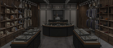
Orderly arrangement: First of all, the shelves of this pharmacy are neatly arranged and sorted by function, so that people can see at a glance. Whether it is a cold fever or daily health care, it can be quickly located and save valuable time!
Clear label: Each drug is labeled with a detailed label, including the use, taking method and other information, to avoid the doubt when buying medicine, feel particularly intimate.

I thought that the design of the pharmacy was to break the space layout of the traditional pharmacy, and to innovate the design of the old showcase.
The soft tone is more in line with the design of the pharmacy store, modern simple design, open shelves at a glance. Soft lighting illuminates every corner, allowing customers to easily find what they need and enjoy a convenient shopping experience.

Choosing thick and durable, beautiful and atmospheric shelves is the key! The simple and fashionable design is not only practical but also can improve the appearance level of the pharmacy. Let customers fall in love with your pharmacy at a glance, and good looking shelves are absolutely indispensable weapons! Come and build your ideal pharmacy!

